Building a Website for a 40-Year-Old Hair Salon
A local salon in Smithfield, Utah had been cutting hair for four decades without a website. Here's how I built one from scratch with vanilla HTML, CSS, and JS.
On this page
- What the site needed to do
- The design system
- Scroll animations without a library
- Staggered card animations
- The hero section
- The hard part wasn’t code
- What I’d do differently
- Where it stands
- Update, July 2026: the redesign
- Build the page around how the business actually works
- Sourcing every claim on the page
- A visual direction with an actual idea
- Content out from behind JavaScript
- The rest
Updated July 2026: the site has since been redesigned from the ground up. The original build log is below; skip to the redesign for what changed and why.
A local hair salon in Smithfield, Utah reached out and needed a website. Total E’Clips has been cutting hair for over 40 years, serving families across Cache Valley. Three stylists, a loyal client base, and not a single page on the internet. No Google Business profile to speak of, no social media presence beyond a Facebook page, nothing. They wanted something simple that told people who they are, what they offer, and how to book.
The catch: there was almost nothing to work with. No existing branding, no professional photos, no written copy. Just a business name, a phone number, and 40 years of word-of-mouth reputation.
What the site needed to do
This isn’t a SaaS product or a portfolio piece. It’s a small-town salon. The site needed to:
- Show what services they offer (cuts, color, nails, waxing)
- Make it dead simple to call and book
- Look professional enough to build trust with new customers searching online
- Work perfectly on phones, because that’s how most people will find it
I went with plain HTML, CSS, and vanilla JavaScript. No frameworks, no build tools, no npm install. For a single-page site like this, shipping three files is the right call. It loads instantly, there’s nothing to break, and anyone can open the code and understand it.
The design system
I wanted the site to feel warm and premium without looking like a generic template. The color palette centers on a warm tan/gold accent against charcoal backgrounds. All defined as CSS custom properties so the entire theme can be updated by changing a few values:
:root {
  --color-dark: #2C2C2C;
  --color-light: #FAF8F5;
  --color-accent: #C4A882;
  --color-accent-hover: #A8896A;
  --color-body: #4A4A4A;
  --color-text-light: #F5F0EB;
  --font-heading: 'Bebas Neue', sans-serif;
  --font-body: 'Raleway', sans-serif;
}
Bebas Neue for headings gives it that bold, modern salon feel. Raleway at weight 300 for body text keeps everything light and readable. Two fonts, one accent color, and the whole site feels cohesive.
Scroll animations without a library
I wanted elements to fade in as you scroll down the page. Most people reach for a library for this. You don’t need one. The IntersectionObserver API does exactly this in about 12 lines of JavaScript:
const observer = new IntersectionObserver((entries) => {
  entries.forEach(entry => {
    if (entry.isIntersecting) {
      entry.target.classList.add('is-visible');
      observer.unobserve(entry.target);
    }
  });
}, { threshold: 0.1 });

document.querySelectorAll('.animate-on-scroll').forEach(el => {
  observer.observe(el);
});
The CSS side is just as simple. Elements start translated down and invisible, then transition into place:
.animate-on-scroll {
  opacity: 0;
  transform: translateY(30px);
  transition: opacity 0.6s ease, transform 0.6s ease;
}

.animate-on-scroll.is-visible {
  opacity: 1;
  transform: translateY(0);
}
The key detail: observer.unobserve(entry.target) after the animation fires. Each element animates once and then the observer stops watching it. No wasted cycles on elements that already appeared.
Staggered card animations
The service cards cascade in one by one instead of all appearing at once. This is pure CSS, no JavaScript timing needed. Each card gets a slightly longer transition delay:
.service-card:nth-child(2) { transition-delay: 0.1s; }
.service-card:nth-child(3) { transition-delay: 0.2s; }
.service-card:nth-child(4) { transition-delay: 0.3s; }
.service-card:nth-child(5) { transition-delay: 0.4s; }
.service-card:nth-child(6) { transition-delay: 0.5s; }
When the IntersectionObserver triggers is-visible on each card, the delays mean they appear in sequence. It’s a small touch that makes the page feel alive instead of static.
The hero section
The hero uses a CSS gradient background with an SVG pattern overlay for texture. No images needed, so it loads instantly and scales to any screen:
.hero {
  position: relative;
  height: 100vh;
  min-height: 600px;
  display: flex;
  align-items: center;
  justify-content: center;
  background: linear-gradient(135deg, #2C2C2C 0%, #5C4A3A 40%, #C4A882 100%);
  overflow: hidden;
}
A subtle cross pattern is layered on top at 3% opacity using an inline SVG data URI in the ::before pseudo-element. You barely notice it, but it adds depth that a flat gradient alone doesn’t have.
The hard part wasn’t code
The code came together fast. The actual challenge was content. When a business has had zero internet presence for 40 years, there’s nothing to reference. No existing copy to refine, no “About Us” page to rewrite, no photos to pull from.
I had to piece together the story from conversations. Who are the stylists? How long have they been there? What’s the vibe of the place? The copy needed to sound like a real neighborhood salon, not a marketing template. Lines like “Your neighborhood salon for over 40 years” worked because they’re true and specific. Generic phrases like “providing excellent service” would have said nothing.
Getting the testimonials right took multiple rounds too. Real words from real clients, not AI-generated filler.
What I’d do differently
Use a static site generator. Vanilla HTML was fine for this scope, but if the salon ever wants a second page or a blog, editing raw HTML gets tedious fast. Astro would have been a natural fit. Still static output, still fast, but with components and templating that make updates easier.
Get all the details upfront. I went back and forth more than I should have on service descriptions, the “About” section copy, and contact details. Next time I’d send a structured questionnaire before writing a single line of code. Business hours, services with descriptions, team bios, payment methods, accessibility info. Collect it all in one pass.
Push harder on photography. The images/ folder is empty. The site works without photos, the gradient hero and SVG icons carry the visual weight. But a few real photos of the salon interior and the stylists at work would add a level of authenticity that design alone can’t replicate.
Where it stands
The site is live and does what it needs to do. It gives Total E’Clips a real online presence for the first time in their 40-year history. Customers can find them, see what they offer, and call to book, all from their phone. The entire thing is three files: one HTML, one CSS, one JS. No dependencies, no build step, nothing to maintain.
Sometimes the right tool for the job is the simplest one.
Update, July 2026: the redesign
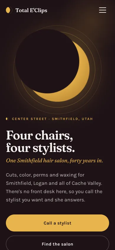
The original site ran for a few months, and then I rebuilt it completely. The screenshot at the top of this post is the new one.
The honest reason for the redesign: the first version was a template in disguise. Dark hero, six service cards, a testimonial row, a “Call to Book” button that opened a modal. It looked fine and it said nothing. Worse, the modal was hiding the single most useful thing on the page.
Build the page around how the business actually works
Total E’Clips has no front desk. Nobody answers a main line. Four stylists work there, and each one keeps her own book and her own phone. So “Call to Book” was the wrong verb entirely, and putting four numbers behind a modal meant every visitor had to click before they could do the one thing they came to do.
The new page leads with the four chairs. April, Alicia, Wendy, and Sherri each get a card with her name and her number as a plain tel: link. The hero copy says it outright: “There’s no front desk here, so you call the stylist you want and she answers.” The modal is gone.
That’s the general lesson. Before designing anything, find the mechanic that makes this business different from the twelve others in the same category, then make that mechanic the layout.
Sourcing every claim on the page
The first version’s testimonials were attributed to first names only: Sarah, Michelle, Jenna. Even where the sentiment is accurate, an unsourced first name is the weakest possible form of social proof. It reads exactly like filler whether or not it is.
The salon has 56 Google reviews averaging 4.9 stars, and several name individual stylists. The new site quotes four of them verbatim, with the reviewer’s full name, the source, and placement directly under the stylist the review is about:
Been having Sherri do my hair for almost 30 years. Everyone there is friendly and helpful.
That’s better copy than anything I would write, and a visitor can go verify it.
The same standard applied to everything else. “Walk-ins always welcome” came out of the men’s cuts description, because Google lists the salon as appointments-recommended and nothing on our side supported the stronger claim. Hours are now stated as by-appointment per stylist, which is the truth, rather than a schedule nobody published. The rule I’d take forward: if you can’t point at where a claim came from, it doesn’t go on a client’s page.
A visual direction with an actual idea
The salon’s name is an eclipse pun. The first site did nothing with it.
The new one is built from the two states of an eclipse. A dark hero, totality, with a gold-rimmed disc of light rising into it, then a bright page below the fold. The palette is pulled from the salon’s own storefront sign, a deep maroon board with cream serif lettering:
:root {
  --totality: #1E1216;  /* deep oxblood-black, the moon disc */
  --corona:   #E8B44C;  /* ring of light, the accent */
  --mirror:   #F5F2F0;  /* warm near-white, a salon mirror */
  --maroon:   #7B2233;  /* the sign board itself */
  --display: 'Fraunces', Georgia, serif;
  --body: 'Karla', system-ui, sans-serif;
}
Fraunces over Karla replaced Bebas Neue over Raleway. The corona disc is a radial gradient with a few concentric rings, no image, so it still costs nothing to load.
Content out from behind JavaScript
One real bug carried over from the first build. The scroll-reveal elements started at opacity: 0 in the stylesheet, which meant that if JavaScript failed, the page was mostly blank.
The fix is one line in the <head>:
<script>document.documentElement.className += ' js';</script>Every reveal rule is now scoped to .js .reveal, so no-JS visitors get the full page immediately and the animation is purely an enhancement. The observer also bails out early and reveals everything when prefers-reduced-motion: reduce is set.
The rest
Also in this pass: a real owner-published team photo (WebP with a JPEG fallback), a rebuilt OG image in the new palette, HairSalon JSON-LD with per-stylist employee entries and the aggregate rating, a FAQPage block, and a service-area section naming the Cache Valley towns people actually drive in from.
Still three files. Still no build step. The thing that changed was not the stack, it was paying attention to how the salon works and refusing to ship anything I couldn’t source.
Related: Total Eclips and more side projects.
Frequently Asked Questions
- Start by gathering the story through conversations: who works there, what they do, how long they have been around. Write copy from those real details instead of generic marketing language. Use CSS custom properties for a quick, cohesive design system when there are no existing brand assets to reference.
- Use the browser's IntersectionObserver API. Observe elements with a CSS class like animate-on-scroll, add an is-visible class when they enter the viewport, and unobserve them after the animation fires. The CSS transitions handle the actual fade-in and translate effect. No external library needed.
- Yes, for single-page or very small sites. The entire Total E'Clips site is three files: one HTML, one CSS, one JS. It loads instantly, has no dependencies, nothing to break, and nothing to maintain. For anything beyond three pages, a static site generator like Astro would scale better.
- Apply incremental transition-delay values to each card using nth-child selectors (0.1s, 0.2s, 0.3s, etc.). When the IntersectionObserver adds the is-visible class to all cards at once, the delays cause them to appear in sequence, creating a cascade effect without any JavaScript timing logic.
- Content, not code. When a business has zero online presence, there is no existing copy to refine, no photos to use, and no About page to rewrite. You have to piece together the story from conversations and write everything from scratch, which takes more rounds of revision than the development itself.
- The first version copied the standard salon-site template: a hero, service cards, and a Call to Book modal. But the salon has no front desk. Each of the four stylists keeps her own book, so the modal was hiding the one thing a visitor actually needs, her direct phone number. The redesign put the four numbers at the center of the page, replaced first-name-only testimonials with verbatim Google reviews that name their reviewer and stylist, and corrected unsupported claims about walk-ins and hours.
How do you build a website for a business with no online presence or branding?
How do you add scroll animations without a JavaScript library?
Is vanilla HTML and CSS still a good choice for small business websites?
How do you create staggered card animations with CSS only?
What is the hardest part of building a website for a small local business?
Why was the Total E'Clips site redesigned in 2026?

Founder of Vient and senior staff engineer
Caden Sorenson runs Vient, an independent studio building iOS apps, web tools, and client websites, including Travel Vient, a travel research site with everything cited to primary sources. He's a senior staff engineer with 15+ years of experience building iOS apps, web platforms, and developer tools, and a Computer Science graduate from Utah State University. Based in Logan, Utah.
Related posts
- Building a Pirate-Themed Barbershop Site, Mostly by Prompting ClaudeA barber in Cove, Utah had an Instagram and no website. I gave Claude the right prompt, all the real details, and a styling direction, and it built the three files. The hard part was getting the content, not the code.
- Moving a Client Site Off an AI Builder, Rebuilt From ScratchLandingSite AI got Griffin Renovation online fast, but SEO limits and vendor lock-in pushed me to rebuild the whole thing in plain HTML, CSS, and JavaScript.
- I Shipped a Client Site in an Afternoon Using an AI BuilderA renovation company needed a website fast. I used LandingSite.ai to go from nothing to live in a few hours, and here's what actually worked.
Built as part of
View the project →